14 Free (And Affordable) Marketing Tools for Small Businesses
In marketing, where attention spans are dwindling and information overload is rampant, every design element counts. One often overlooked yet incredibly powerful tool is white space. Contrary to its name, white space—or negative space—is not empty, but rather a strategic design element that can significantly impact the effectiveness of your marketing materials.
What is White Space?
White space refers to the empty areas surrounding elements in a design, such as text, images, and logos. While it may seem counterintuitive, this blank space is not wasted; it's a valuable asset that can be harnessed to enhance your overall design. Think of white space as the breathing room your design needs to shine.
Benefits of White Space
The strategic use of white space offers numerous advantages for your marketing efforts:
Improved Readability & Clarity: White space allows the eye to rest, making content easier to absorb and comprehend. By giving elements room to breathe, you enhance readability and reduce fatigue.
Enhanced Focus & Hierarchy: Strategic placement of white space draws attention to key elements and creates a clear visual hierarchy. This guides the viewer's eye and ensures your message is received loud and clear.
Increased Credibility & Sophistication: Whitespace can elevate the perceived quality of your design, conveying a sense of professionalism and sophistication. It creates a clean, polished look that inspires trust.
Improved User Experience (UX): By reducing clutter and improving overall organization, white space contributes to a more pleasant and efficient user experience. This can lead to increased engagement and conversions.
White Space in Action: Examples
The impact of white space is evident across various marketing channels:
Websites
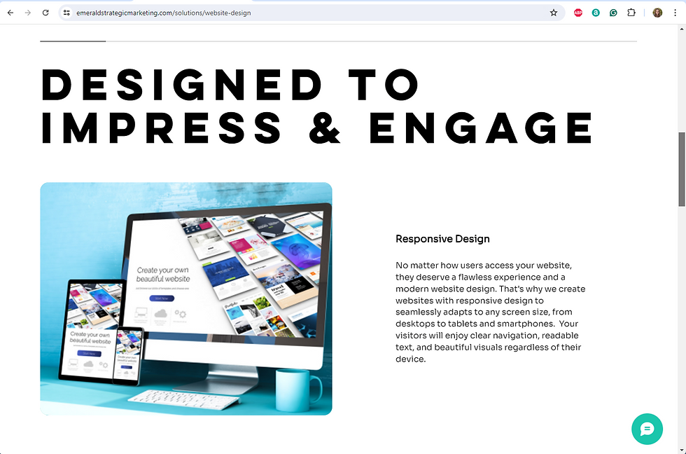
Good Use: A modern website design featuring ample white space between sections and content blocks creates a clean, airy aesthetic that enhances readability and user experience.
Bad Use: A website crammed with text, images, and CTAs (calls to action) can overwhelm visitors and hinder navigation.

Emails
Good Use: Incorporating white space into email marketing best practices helps improve deliverability and engagement. Clear separation between sections and elements enhances readability and prevents information overload.
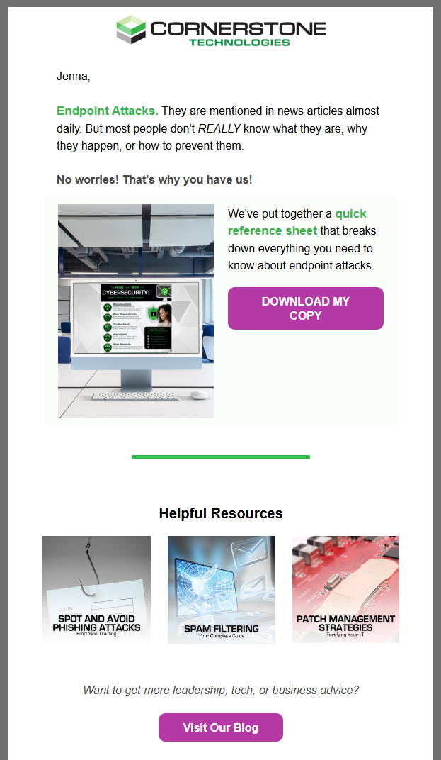
Bad Use: A cluttered email with minimal white space can be overwhelming and lead to low click-through rates.

Graphic Design
Good Use: A minimalist poster or brochure with strategic use of white space can create a powerful and memorable impact. The empty space allows the key elements to stand out.

Bad Use: A graphic design filled with competing elements and little white space can create visual chaos and distract from the message.

Final Thoughts
White space is a fundamental design principle that should not be overlooked. By understanding its importance and applying it effectively, you can create more engaging, effective, and visually appealing marketing materials. So, the next time you're designing a website, email, or graphic, remember the power of white space and give your designs the breathing room they deserve. Experiment with different amounts of white space to find the perfect balance for your brand and audience. The results may surprise you!

